Tutorial Assets
The following assets were used during the production of this tutorial.Step 1
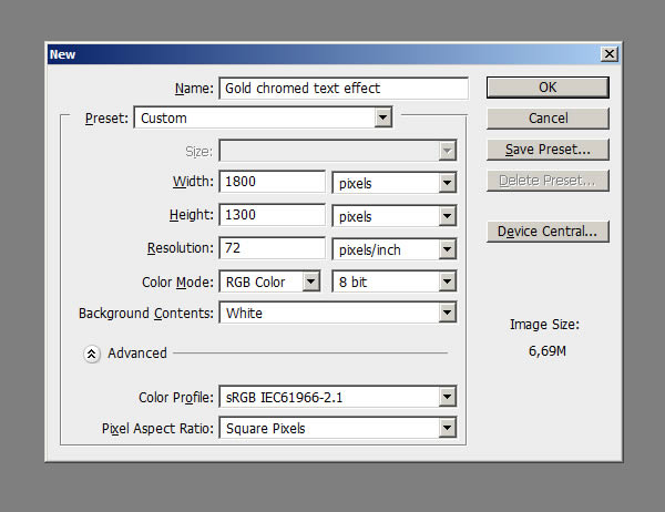
Before opening Photoshop, install the font Rothenburg Decorative and these grunge brushes.Open Photoshop and Create a New Document, 1800 x 1300 pixels in RGB mode, 72 DPI and finally then Fill the background with this dark grey color #1f1f1f.
Step 2
Create a New Layer, name it ‘texture’ and using these Grunge Brushes click a couple of times in the center of the document using a white color. Use different brushes, try to cover the center of the document, varying the textures.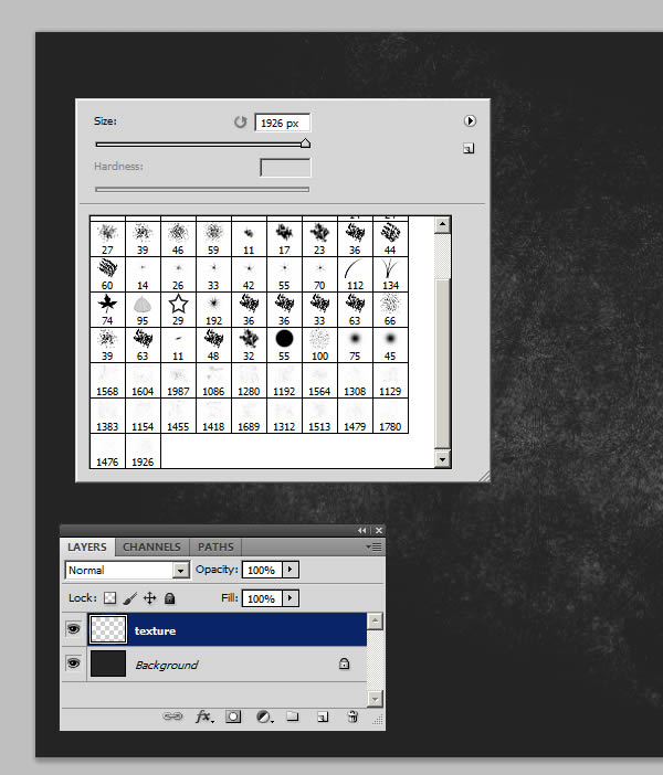
Step 3
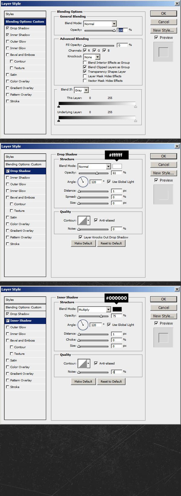
Double-click on the thumbnail of the Layer ‘texture’ to open the Layer Style panel. Into the ‘Blending Options’Reduce the ‘Fill’ to 0, then apply a ‘Drop Shadow’ and an ‘Inner Shadow’ using these settings. This will give the texture a realistic embossed look.
Step 4
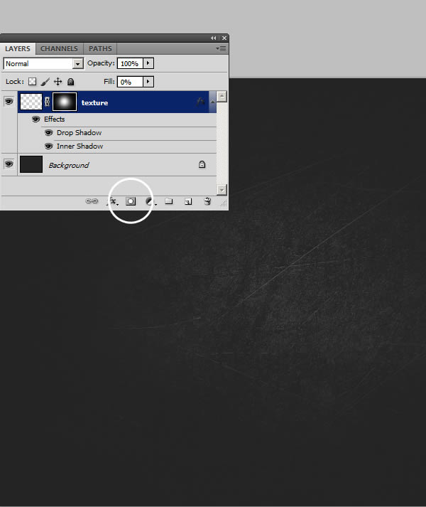
Click on the ‘Add Layer Mask’ icon, then click Command/Ctrl + (I) to invert it.Pick a big soft Brush (hardness: 0% – size: 950px) and click in the center of the document. This way the ‘texture’ Layer will be shown only in the center, fading on the edges of the document.
Step 5
Using the ‘Type Tool’ (T) and these settings, type the word ‘Othello’ or whatever you want. If you can’t see the ‘Character Window" go to Window > Character.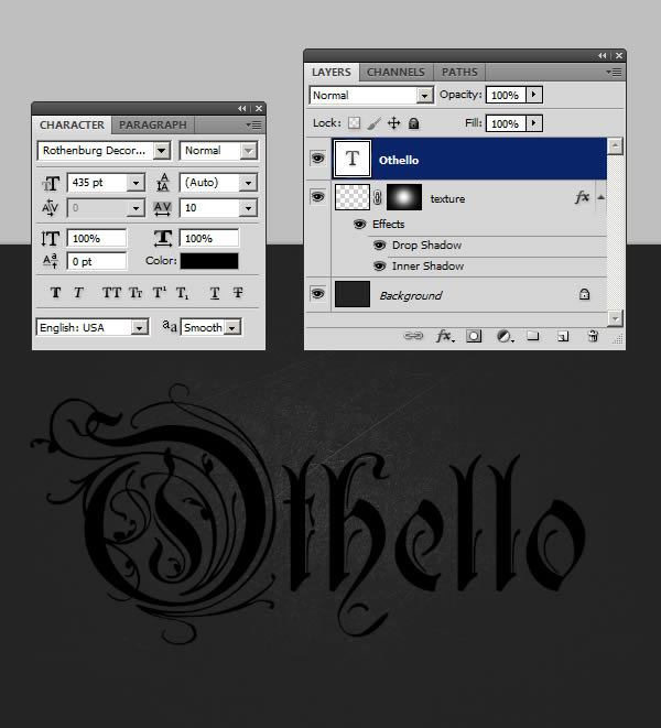
Step 6
Open the ‘Layer Style’ of the ‘Othello’ Text Layer and apply these settings. Below each step you can find a preview for the effect just added.
Step 7
Once you’ve modified the Style, click Ok. Now select the word ‘Othello’, using the Type Tool (T). Select everything beside the first capital letter and reduce the kerning to -5 as in the image below. You can find the Character Window under Window > Character.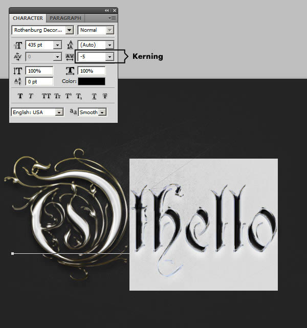
Step 8
Duplicate this Layer with Command/Ctrl + (J), right-click on the Layer’s thumbnail and choose ‘Clear Layer Style’. This way the text below matches exactly the one above, and now we can add more effects. My favorite way to work with 2 Layer Styles, is to create a solid base as we did to the first Text Layer, and then add lightings and reflections on the second Layer above. This way you can blend easier the lights and colors with the textures of the Layer below.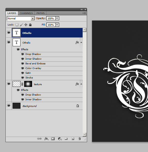
Step 9
Let’s go on, adding a Layer Style to this second ‘Othello’ Text Layer. Double click on its thumbnail to open the Layer Style panel. Set fill opacity to 0 in blending options.
Step 10
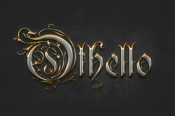
The effect is pretty much done, but we need to make it look crisp and realistic, in this final step. Take a look at the trick with the ‘Stroke’: dropping down it’s Opacity to ’0′ it works almost as a layer mask, hiding the Layer on its edges. A Stroke of 3px ‘Inside’, for example, will hide the Text for 3 px along the edges, revealing what’s below in that 3px range. Once you’ve finished with these settings, click Ok to apply the effect.




0 Comments:
Post a Comment