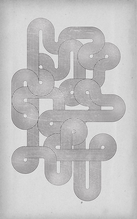
The
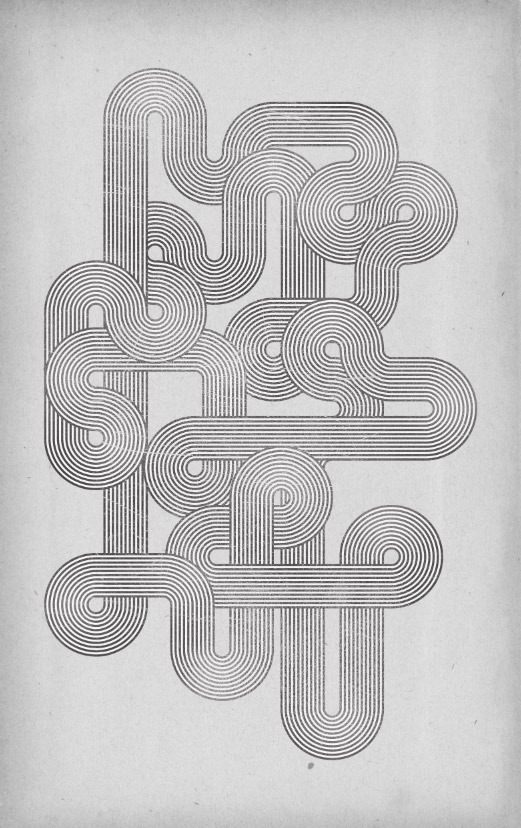
design we’ll be creating features a series of flowing striped lines
interweaving and looping around the page to form an intriguing
composition. We’ll use a plain black and white palette to keep the
design in check with the original Mexico Olympics branding and use
textures and brushes to distress our clean vector design to give it that
aged appearance.
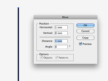
Start
work in Illustrator by drawing a long thin rectangle on the artboard.
Alter the width using the fields in the top bar to 1mm, then hit the
Enter key to open up the Move options. Enter 1mm in the Horizontal field
then click the Copy button.
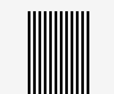
Press
CMD+D to repeat the transformation to generate a series of lines, then
select each alternate line and change the fill to white, leaving a
striped effect.
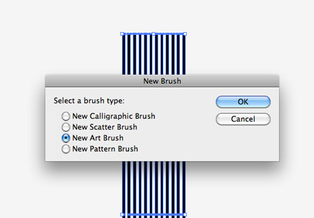
Select
all the lines that make up the pattern and click the ‘New’ icon at the
bottom the of the Brushes palette. Check the ‘New Art Brush’ option.
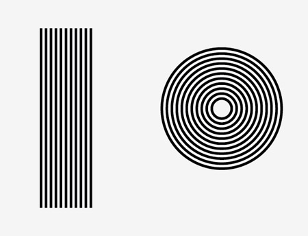
You
can now use this new brush by applying it to any path. Draw a line and a
circle then add the brush as the stroke fill to create two striped
patterns.
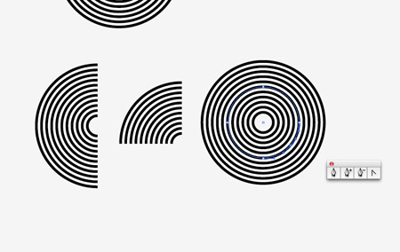
Make
duplicates of the circle then delete out a number of points to form
half and quarter circle shapes. To create a 3/4 shape, add a new anchor
point halfway between two original points then delete it using the
Direct Selection Tool.
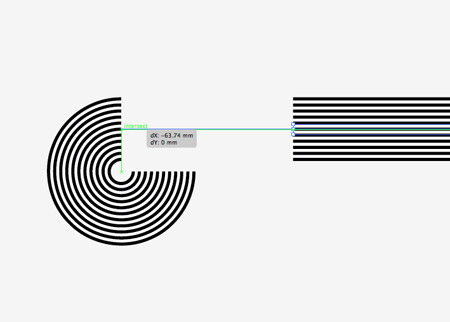
Save
all these elements to one side as they’ll be used as building blocks to
form the whole composition. Hold ALT while dragging across a shape to
create a duplicate, then begin aligning various shapes to each other.
Toggle on Smart Guides to make the alignment process a breeze. A green
notification will display when the two paths are aligned as an
Intersection.
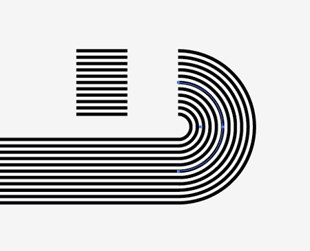
Hold
Shift while rotating shapes such as the half circle to fit to the
opposite end of the path. You can also shorten the straight lines to
create smaller paths.
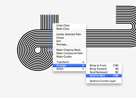
Arrange
the stacking order using the menu options or the shortcuts to give the
elements a weaved appearance where they wrap over and under each other.
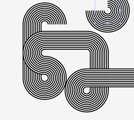
Randomly
cycle through the various elements to continue the flow of your path.
Using two 3/4 shapes near each other will create cool flowing bends.
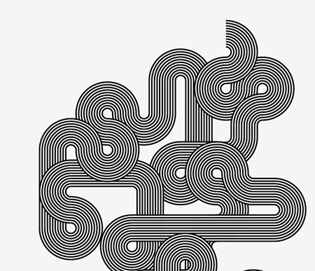
As
the path weaves around the document the design really starts to take
shape. Remember to keep the overall layout in check with the orientation
of the final poster design.
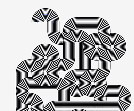
The
series of twists and curves lead the eye all the way around the design
in a kind of hypnotising fashion. Remember to alter the stacking order
to add that extra dimension where objects flow under and over each
other.
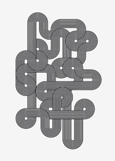
The two open ends can be disguised by accurately hiding them underneath another object to make the line continuous.
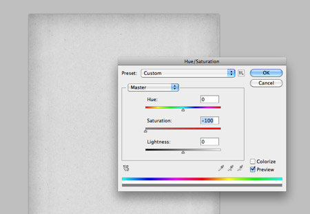
The vector portion of the design is complete, now let’s create a grungy style canvas as a base for the artwork. Paste in a
vintage paper texture and remove the saturation.
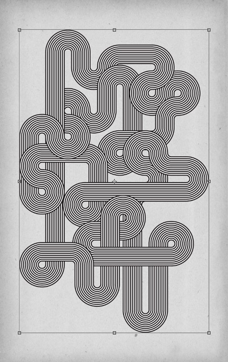
Paste in the vector elements from Adobe Illustrator and scale and align them to the centre of the page to fill the canvas.
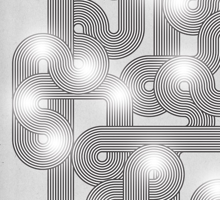
Use
a soft white brush to add a few highlights in key places around the
design. Turn down the opacity to around 30% to tone down the impact of
the highlights so they’re not quite as prominent, but still subtly alter
the tones of the design.
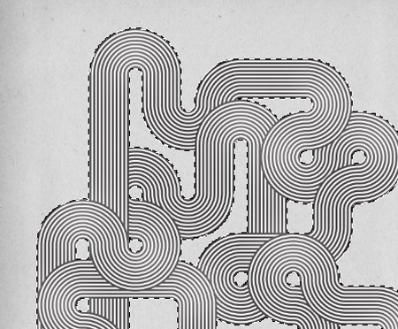
CMD+Click
on the thumbnail of the vector lines layer to load the selection. Press
CMD+Shift+I to inverse the selection then delete out the excess from
the highlights layer.
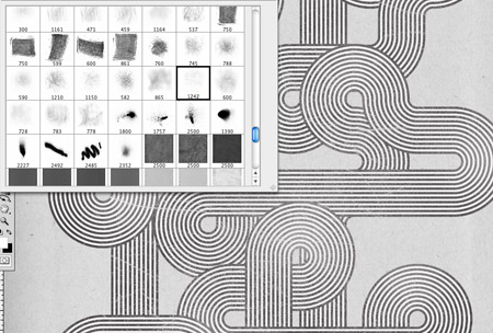
Add a layer mask to the vector lines layer then use a series of
subtle grunge brushes to really rough up the design with distressed cracks and textures to give that aged and weathered retro appearance.
The
final design works really well in its monotone format and relates well
to the original Mexico Olympics style. The interweaving lines really do
draw in the eye and allow you to follow the paths all the way around the
design.
 About The Writer
Hello! My name is Tommy. I'm a blogger, I love graphics design and now i went to Architechture Technical Senior High School. |
Facebook |




 In this new tutorial we’re going to learn how to extract an object from a
white background,create a paint effect using some brushes and create a
quick HDR effect in a few easy steps. So let’s start.
In this new tutorial we’re going to learn how to extract an object from a
white background,create a paint effect using some brushes and create a
quick HDR effect in a few easy steps. So let’s start.
 Materials Needed: